Art Forum Introduction – Dennis Davis
Connecting lines, circles and squares; representing objects as shapes and forms – the infinite possibilities of expression are fascinating to me. As a child, drawing was a means of escape and provided a path to creativity which, in my case, was essential for confidence building.
In this endeavor, I hope to express how my drawings and paintings were created -whether through planned composition or spontaneous flow, and how the processes of color selection, representation, and expression were conceived.Acceptance is not my motivation for creating art work. I merely explore and record what comes to mind; however, this website provides an interesting opportunity for feedback and interaction. Any thoughts or reactions to my work are welcome.

This particular painting began with a wine bottle and guitar. From that point, it evolved from thoughts, feelings and visions derived from the initial shapes and colors applied to the canvas, and my mood at the time. From there it took shape during frequent evaluations and new moments of inspiration. The painting is not easily be categorized as influences of abstract and impressionist painting styles are combined. The components can be compartmentalized or seen as a whole, and the viewer will form their own stories and experiences each time it is examined. Painting is 60.9 cm x 76.2 cm.
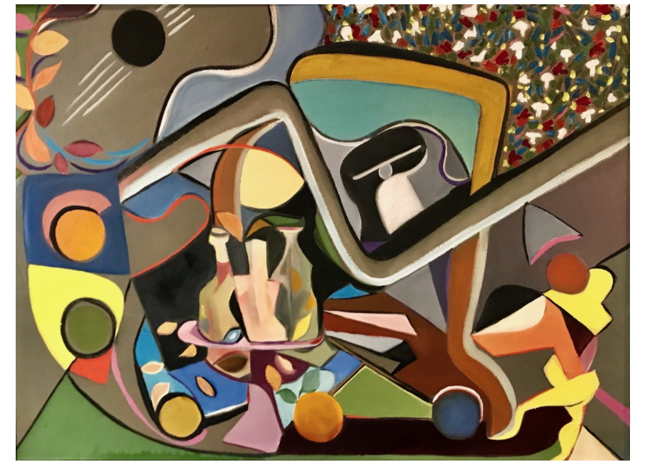
These are paintings two and three in an abstract series of six paintings. The illusions are built around still life and motion. These are mainly just another exercise in spontaneous expression. My goal of artistic discipline still on the horizon.
Here is another of DD’s paintings…….For years, I have promised to provide some feedback, but have always fallen at the fence. But we are having a video meet up next week. Do…it’s bite the bullet time. No more ‘see you at the top’….this is the top.
Let’s start with my problem or at least some aspects of it. I have not seen the original. I doubt the photo does it justice. If for no other reason, that it gives away nothing as to the texture of the painting……An oil painting with no texture……Now, what is that for a beast? The problem is compounded, because the original painting is relatively smooth and is intended to be just that. I got this information from the horse’s mouth.
And here is some more…….The painting was carried out by area. – sort of bit by bit. Reminds one of a ‘composition’, or somesuch. DD thinks of it as a still life, but there is no attempt to make the objects ‘live’. One might think of them as ‘symbolic’, hardly abstract, although in some sense abstracted. Maybe ‘representative’ comes to mind. Even sort of ‘generic – have the features of an object. Take the wine glass for example. It’s a wine glass alright, but no wine, no glass, so to speak. But no mistaking it for other than a wine glass. Maybe it’s like a sign, as in signing. An X for path closed. An —-> for to go this way.
The canvas is black, not sure why, but it provides a great contrast. The surface is relatively smooth. DD achieves this by mixing oil paint with linseed oil. Gives a better flow. The background and foreground are the same paintwise. That adds to the flatness in my view. DD rarely paints over anything. The black paint background exerts control over the colours by isolation.
DD’s own comments are repeated here, for ease of reader synthesis.
Connecting lines, circles and squares; representing objects as shapes and forms – the infinite possibilities of expression are fascinating to me. As a child, drawing was a means of escape and provided a path to creativity which, in my case, was essential for confidence building.
In this endeavor, I hope to express how my drawings and paintings were created -whether through planned composition or spontaneous flow, and how the processes of color selection, representation, and expression were conceived. Acceptance is not my motivation for creating art work. I merely explore and record what comes to mind; however, this website provides an interesting opportunity for feedback and interaction. Any thoughts or reactions to my work are welcome.
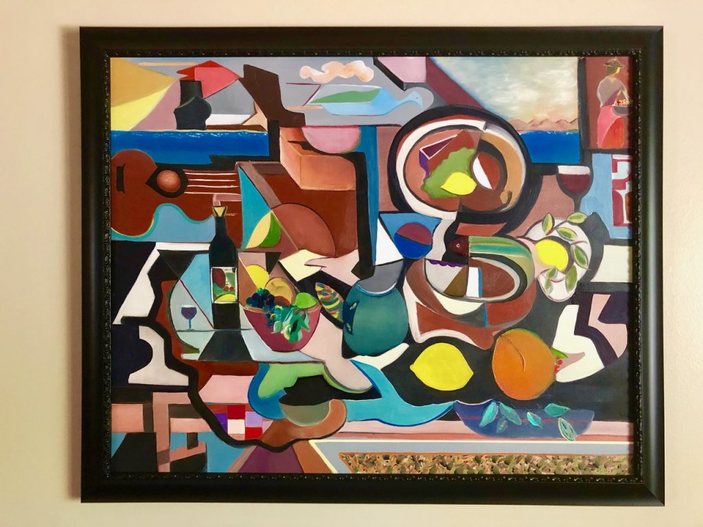
So…….what’s the form?
The painting is very ‘busy’….an invitation to explore, then? Here goes. There is no obvious starting point…..no obvious structure….but everything is ‘filled in’.
Let’s go for the centre as a default ‘abstract’ starting point. Looks like a jug. Seems to have a handle and a spout. 2 connections, but unclear what they are, if anything. Bowl of fruit on the left, lemon on the right. The lemon has shape…… or maybe just an outline and a colour? Wine bottle and wine glass to the left. Both distinguished by colour and shape – but no depth, no texture.
The background black makes the shapes stand out, but kills the colour and any possible interaction. Does this produce a deadening effect? Is it intentional, I wonder.
The guitar is in there somewhere…partly so, at least. It undergoes a level of depth, due to the wine bottle. Not a strong effect, though. Another wine glass on the right…….
Various other shapes bind the objects. Not clear what they are….decorative, background, whimsy, filling the space……? Who knows (maybe DD)…… Let’s give him a turn. I am going to quit, while I am (slightly) ahead…….
Allelujah! the penny has just dropped…… I now know what my problem has been……. the paintings appear to have a background (the black canvas); but no depth. I am used to depth. It’s a primary structural device. It’s one of the first things I look for in a painting. But these paintings have no structural depth, as such. They have parts which are divided off from one another. So….they are more like a visual story. One thing follows/abuts another. Just like Dennis says that he painted them. The other problem is the lack of texture. Again, texture is typically expressive. Here, especially in photos it is noticeable by its absence.
Basically, then, they are juxtaposed objects with some associative memory built in……. They lack the primary features of paintings as I understand them.
So, with what are we left? Quite a lot, as it happens…. First, we have lots of shapes, which are interrelated. For example, in the above painting, we have lemons and leaves. Then, we have objects distributed throughout the painting. For example, lemons and wine glasses. The distribution itself is of interest. For example, the 3 lemons form a shape. The wine glasses, differing in size, make a line. The wine glass and the wine bottle make a link, which is an association.
There are also abstract shapes, which are not just ‘fillers’ or the background, but offer a contrastive view with the more figurative shapes – lemons, wine glasses etc.
The colours and shapes, then, are very varied and go to make up a ‘lively’ and interesting picture. Indeed, picture might be a good descriptor, along with painting……
The whole is lively and thoughtful. Welcoming the viewer to ‘come in and explore’. I did. I enjoyed it.
I can also sleep more soundly at nights………
What do you reckon Dennis? Have I got the right end of the stick? We must be told…….
Dennis’ Reply
Mr. Rubble, just read your critique or opinion of my painting, and I must say you are on the right end of the stick, and you use it well. [1] Many of your observations were spot on, others however in my opinion, express your take on oil painting techniques guided by your experience. Texture may be a true value but to me painting with oil is an open field. [2]. Depth does seem to suffer in my style of painting, an area I will work on. [3] I do believe color is the pathway to depth – so much to learn.
I do value your communication and your interest. Take care and beware… badminton can be brutal.
Stay strong! Best always, sun boy Poll question How many great plumbers become great painters. Result 0.1% How many great painters become great plumbers. Result 0.0% Poll conceived and compiled by me [4].
TUE 21:39
Mr Rubble is JL, whose comments follow:
[1] Glad you think I am ‘on the right end of the stick and use it well’. This means we can have an open-ended discussion – honest, no holds barred, but constructive and on the 2 sides. I have re-started painting……. beware.
[2] ‘Texture may be a true value but to me painting with oil is an open field.’ Can’t disagree with that. You/me make of it what we can and there are many different ways of so doing. The more the merrier, I say. Lack of (rough) texture is texture of its own kind. Horses for courses? I guess it all depends on what you are up to and whether you are getting there. Your paintings definitely have a specific ‘feel’ to them. mesmerising, one might say.
[3] ‘I do believe color is the pathway to depth – so much to learn.’ This is a really raunchy statement. How might this be the case? Where would you start to implement it? Do individual colours have their own depth or is depth expressed by one colour to another. I am sure there are lots of other ways to go. Can’t wait to see how you tackle it and whether its a success.
[4] Great plumbers are more flexible and talented than great painters……
Over to you Sunboy!
See you at the Top!
JL – a further comment (dated 8/3/2024). This is JIT feedback. We have a family video meeting this afternoon…… ’twas ever thus….
The paintings lack depth as a strong organizing feature. I obviously miss that a lot and it confuses me. For example, in the above painting there are 2 instances of what I am calling ‘depth’. Both at the top of the painting. The one on the left shows a road going off into the distance. The one on the right shows the a receding sea and sky with a shoreline in the distance. Both distancing effects mimic our view of the actual world, we see. Further, objects look smaller. The same technique can be used in paintings for the objects depicted therein. DD, however, does not seem to use it. His objects have a spatial relation, but it is more an ‘in front of’ or behind’ relationship. For example, the jug is in front of the leaf and the wine glass is in front a background. One lemon is in front of a black background. However, they could be thought of as at the same level and so neither in front of nor behind.
One way and another, this gives the paintings an impression of ‘flatness’. An impression, which I do not expect and one I am not sure how to interpret. In one way, the absence of depth weakens the structural aspects. On the other, its absence supports a different relationship with the surrounding objects. I think DD is clear enough himself for what and why he does what he does as a painter. It remains for us viewers to work out how we engage, experience and interpret what he does. Well… here’s my 5 cents worth as a start…….